
by Michael Schmidt
Bell Curve
The bell curve is a representation of a normal distribution of data and is used in many areas of research where there are sets of data to analyze. It is most commonly used in population data and is a great way to convey population information with smaller samples of the total population. It is also commonly used in the investment field to represent asset class returns and their distribution patterns.
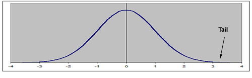 |
| Figure 1: A normal distribution |
Bell Curve Basics
Figure 1 represents a bell curve with a normal distribution. To review the curve: the mean or arithmetic average is plotted in the middle, setting out standard deviations to either side. This particular graph has a mean value of zero and a standard deviation of 1%. This is also known as a standard normal distribution. While it may not normally occur in the real world, it is easy to use for demonstrative purposes.
Applying asset class returns to this curve, it is accepted that 68% of the returns will fall within one standard deviation of the mean, which is between -1% and 1%. It is then accepted that 95.5% of the returns will fall within two standard deviations of the mean, a range of -2% and 2%. Finally, with the tails included, 99.7% of the returns fall between -3% and 3%, or within three standard deviations of 0%.
Predictive Qualities
The goal of using historical returns is to attempt to predict future returns with a reasonable level of certainty. If you use some round numbers of an average annual return for the market of 10% with a standard deviation of 15% (this is a decent approximation of the stock market over the last 20 years) and applying a normal distribution, then 99.7% of the time the predictable range for any given future period could be -35% to 55%, which represents three standard deviations above and below the mean. Whiles it's always good to look at the longest periods available as returns tend to revert to the mean, it's also good to look at shorter time periods to see how the current market behaves.
According to Standard & Poor's, trailing five-year periods for the S&P 500 averaged 5.2% with a standard deviation of 10.4% between 1928 and 2007 (on average).
Shorter time periods, like five-year spans, typically exhibit notably higher risk levels. Using the five-year data, the tails start at around -25 and +35%. There have been annual periods that approach and dip into those tails. These events might be considered statistical anomalies as the probability is rare, but this proves that anything is possible. It also lends additional credibility to the bell curve and shows that the stock market may not be following a normal distribution and carrying considerable amount of unpredictable risk.
Lessons Learned About Risk
What has history taught investors? For one thing, we know that stocks are inherently risky and difficult to forecast using normal probability predictive tools over shorter time periods. Over five years, it has not mattered how stocks were packaged, whether in mutual funds, exchange traded funds (ETFs) or even index funds, they are risky and the numbers prove it. The chart below represents the number of days in which the S&P 500 was up or down by at least 2% between January 1928 and October 2007. In the past, this has been a prelude to some type of event as the stock market tends to be a leading economic indicator. Unfortunately, it is difficult to tell what events the volatility may precede.
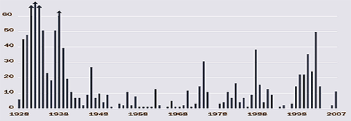 |
| Figure 2: Number of trading days in which the S&P 500's volatility was over 2% from January 1928 to October 2007. |
| Source: S&P 500, Charles Schwab |
Why Invest in Stocks?
Now that stocks have been presented as a scary and risky asset class, it's important to point out that as an asset class, they have outperformed other asset classes over long time periods. If you have a strong stomach and have survived the temptation to panic sell during violent downturns, then a long-term commitment to stocks is a sound strategy.


