The calculation of the signal line requires that you take the difference between the two EMA’s, and from that number create a nine-day moving average. But sophisticated charting software makes life easy with its back-testing capabilities that automatically prepare all the calculations instantly for the user. In this respect, it is sometimes interesting to know the formula used to derive the number, but never necessary to start calculating the numbers on your own.)
Here we look at a number of charts and explain them in detail so that you fully understand this important indicator, and its clear buy and sell signals. First let's highlight the principles of all technical work:
- Stock prices tend to move in trends.
- Volume is always a strong component with the trends.
- And trends will tend to continue with strength, once established.
The first chart is that of Nortel Networks, the Canadian tech giant that saw its stock price drop from the C$120 area to under $9 in a period of 53 weeks. Apart from two very strong sell signals in the summer of 2000, investors paid little attention to these strong overbought points and continued to trade into the "street" hype that was the norm surrounding so many of the tech/internet issues of that period.
Since the early part of Sept 2000, the downtrend that was then established remained intact. Now, having said that, there were buyers from those lofty levels all the way down to its single-digit trading price: why would a broker or financial advisor put a client back into an issue that displays nothing but heavy selling to the downside?
You can see by the trendline drawn on the chart, there was no change in the trend since Aug 2000, and look closely at the diminished volume over the last four months or so shown on the chart. At the same time the moving averages of the MACD were hugging the signal line, showing no clear buy or sell signal at all.
At that time, comments made by company CEO John Roth had indicated that the company would find itself in a rebuilding mode until late 2002 and perhaps even into the early part of 2003. Now from a fundamental standpoint, the technician would have stayed away from this chart because a sideways trading pattern would start to develop once a bottom was established, and in the case of Nortel Networks, the bottom was imminent.
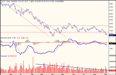
In the second chart, that of Cisco Systems, two very clear sell signals were indicated. The first, in Dec 2000 from the $55 level saw the stock price drop off dramatically to about the $35 level in a matter of a few trading days and then another sell signal triggered another series of down days seeing the issue drop to the mid-teens in a period of two months. Since then, you could see that the company traded in a somewhat narrow range (sideways movement) and the two EMA’s that made up the MACD were hugging the signal line. This is a "wait-and-see" pattern. Take a good look at the trendline, showing the downtrend in volume during this period of sideways trading. No interest, no volume.
In conclusion, MACD helps you to determine changes in trends, either short-term or the long-term variety. Learn to recognize them and do not bet against them.


