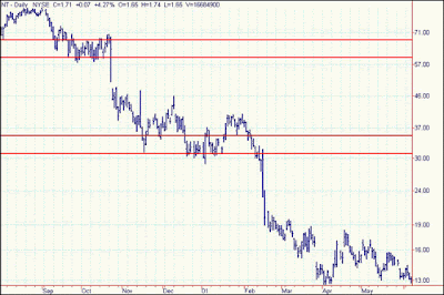
One needs to look no further than Canada’s own Nortel Networks to see that for all intents and purposes, there was very little support and resistance developed on the way down from $123 to its Jun 2002 level of $2.65 or so. Enormous volumes followed the slide all the way down.
It is easy to understand that an intermediate bottom that is developed in a severe downtrend (bear market) over an extended period of time will have very little resistance once the stock price of an issue has fallen far below it. The resistance, if any, that developed at the $63-$66 level in Sept and Oct of 2000 was not likely to be tested again for years, if ever. And the same can be said for the zone created at the $32-$34 level in Dec 2000 and Jan 2001. The overhead supply at these zones was over 368 million shares at the $63-$66 zone, and 439 million shares at the $32-$34 level. In this example, we have not taken into account the traded volume in the Canadian market, where Nortel Networks trades on the Toronto Stock Exchange, and where volumes regularly exceeded those on the New York Stock Exchange.
Edwards and Magee, in "Technical Analysis of Stock Trends", wrote that an older resistance zone may surprisingly show a good deal of resistance providing that little or no change had been made in the capitalization of the company by means of stock splits and/or large dividend payouts. These ideas of the two pioneers of technical analysis held true because 50 years ago, investors bought companies to hold them for a lifetime and would never think to trade the stock into pullbacks, or even use dollar cost averaging. I would find it very hard to believe that there would be many prudent investors who, if they had mistakenly purchased Nortel Networks at the $60 or $30, would still be holding the stock looking for a turnaround.
Let's look at what happens to a stock price when the overhead supply (explained in part 1) is too great to absorb the volume of a potential breakout. In the chart of Microsoft the horizontal lines represent a resistance zone between $66 and $72 over a period from 1999 to 2002. You can see by the arrows the number of times that the stock price had tried unsuccessfully to break through this resistance zone only to fail and fall back to levels in and around the $50 range.
Not had the breakout failed in these instances due to enormous overhead supply, but also a trading pattern developed that traders took advantage of to profit greatly from recognizing the support and resistance zones. Take a look at the pattern that developed since Mar 2000. MSFT fell out of favor with investors in and fell from $110 to the $66-$70 zone and tried valiantly to form a base formation but to no avail, so the stock price fell to the $50 mark.
From that point the pattern began to set up. The up and down arrows indicate the zones that traders used as signals of entry and exit points to increase dramatically portfolio returns. The jury was still out on the status of the stock price in Jun 2002 as the was bouncing out of this zone to trade $15 to $20 higher.
Understanding and recognizing support and resistance zones are important in bear markets, and an understanding of volume overhead supply will help you spot break outs, but also begin to recognize investor psychology and trading patterns that play into the charts we search daily for entry and exit positions.


